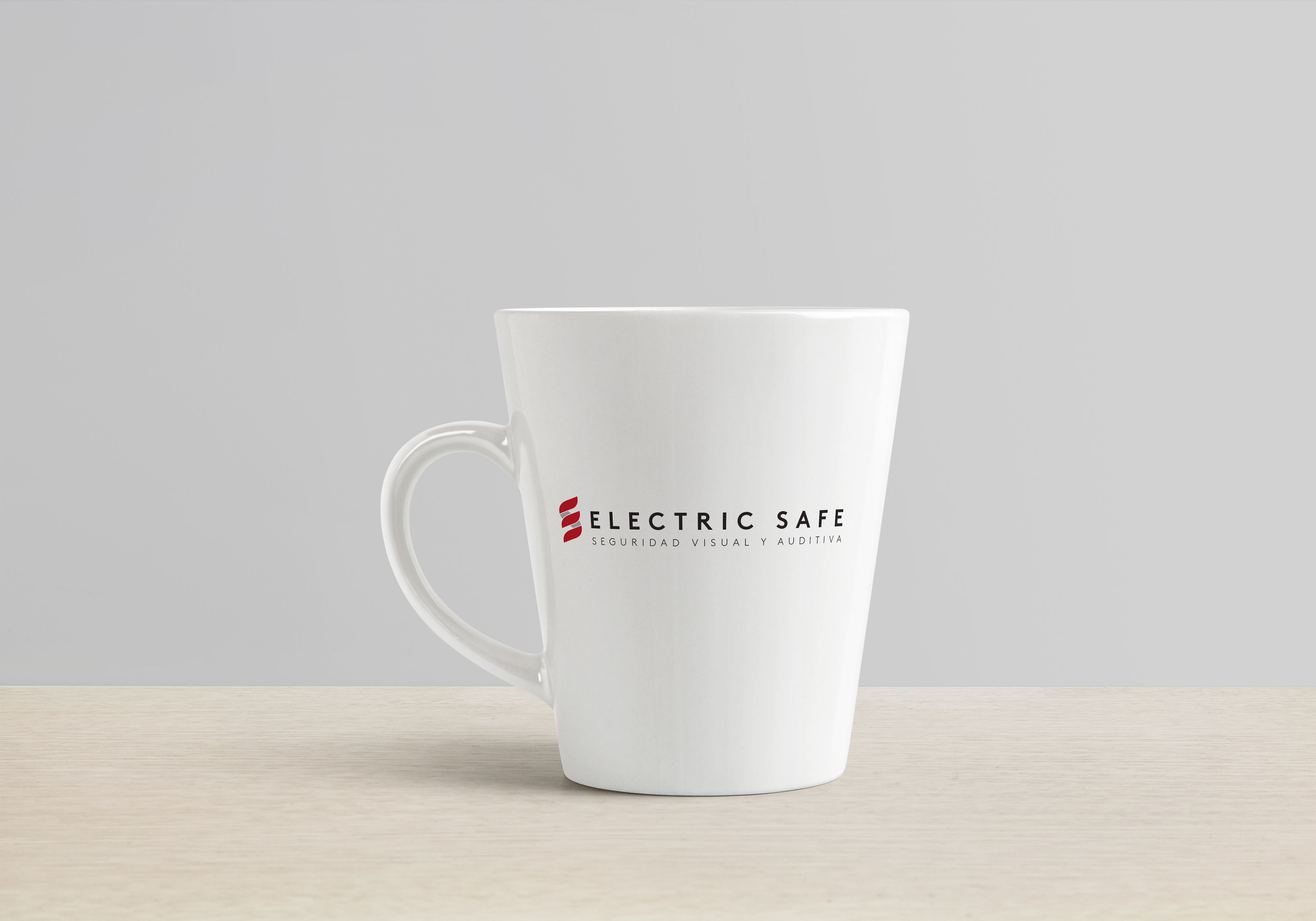
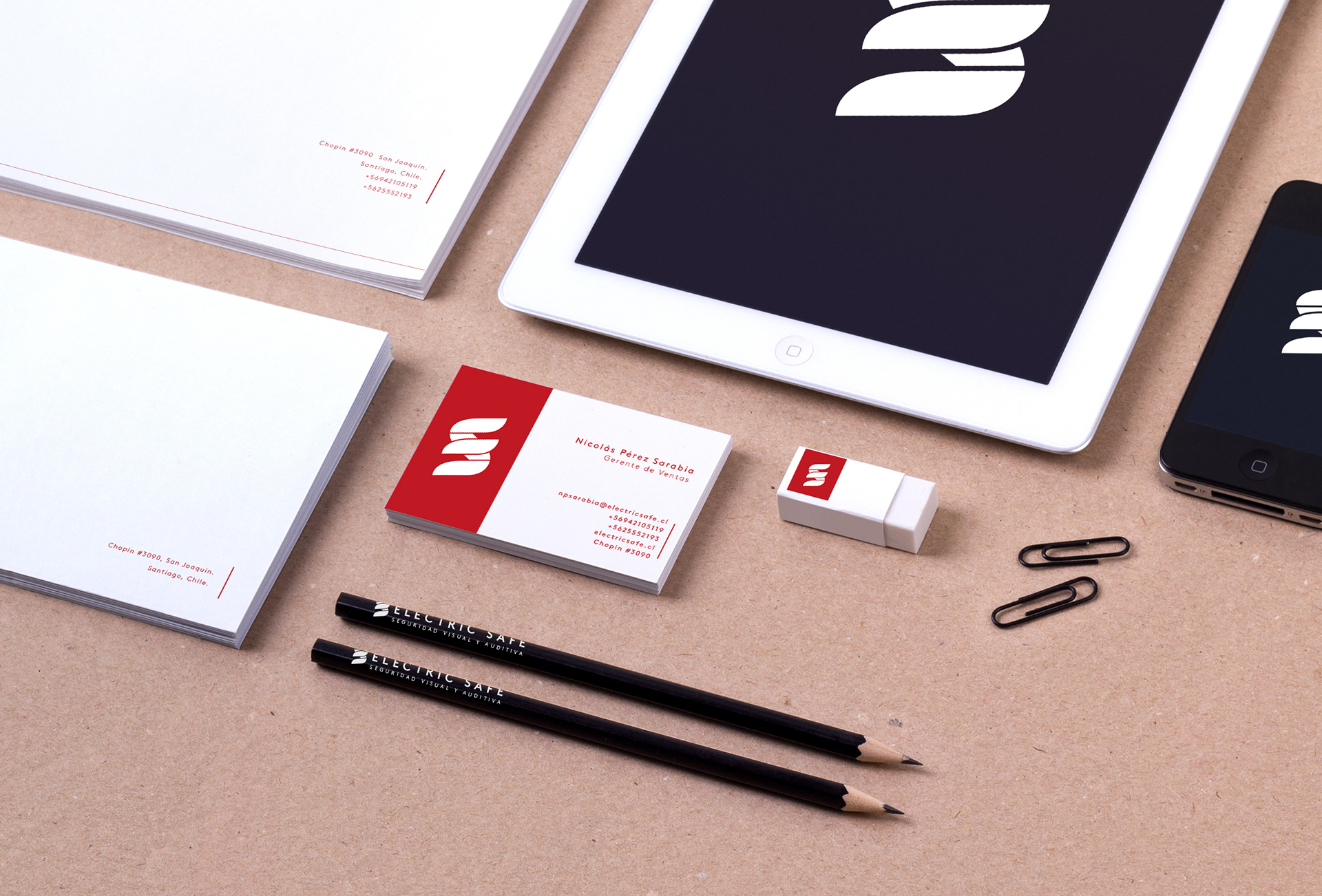
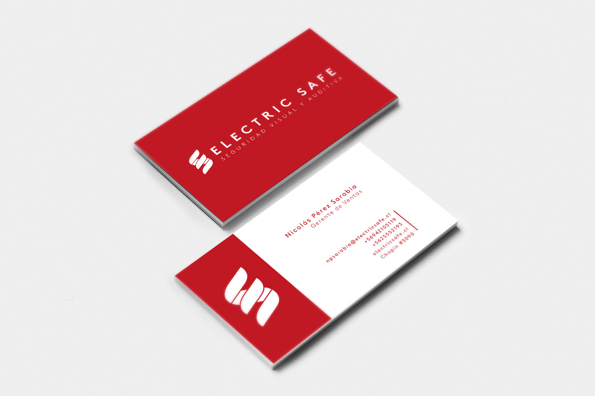
With 7 years in the field of Security, Electric Safe reached a point where confidence is reflected in an external market satisfied with its service quality.
That is why the brand redesign was carried out, generating a character of greater maturity and that, at the same time, is contemporary and maintains the initial essence of the brand.
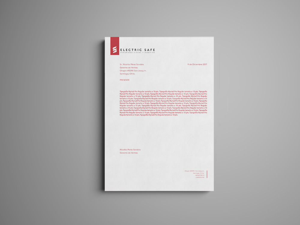
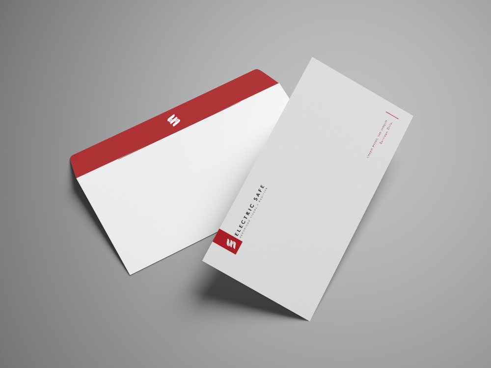
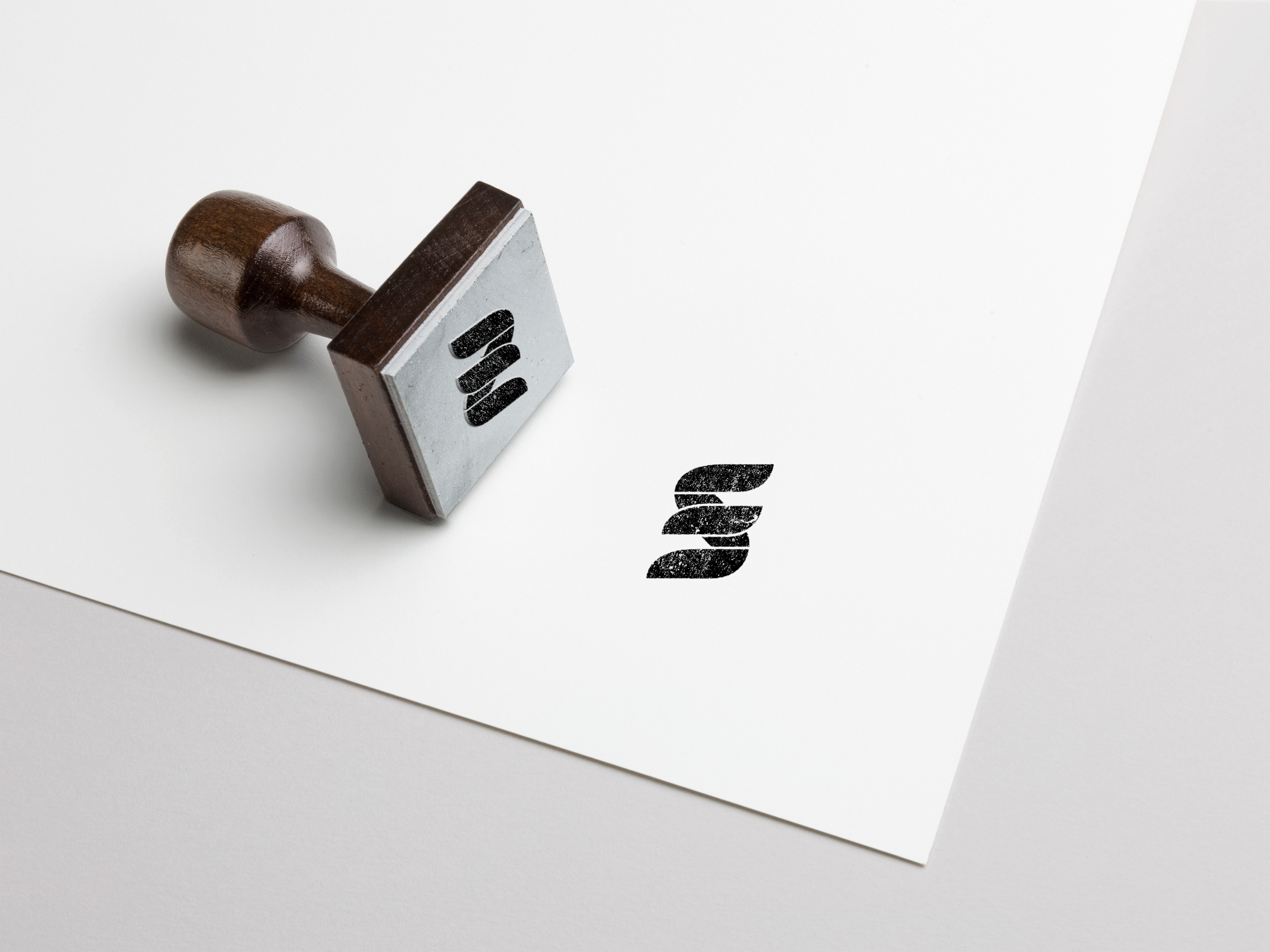
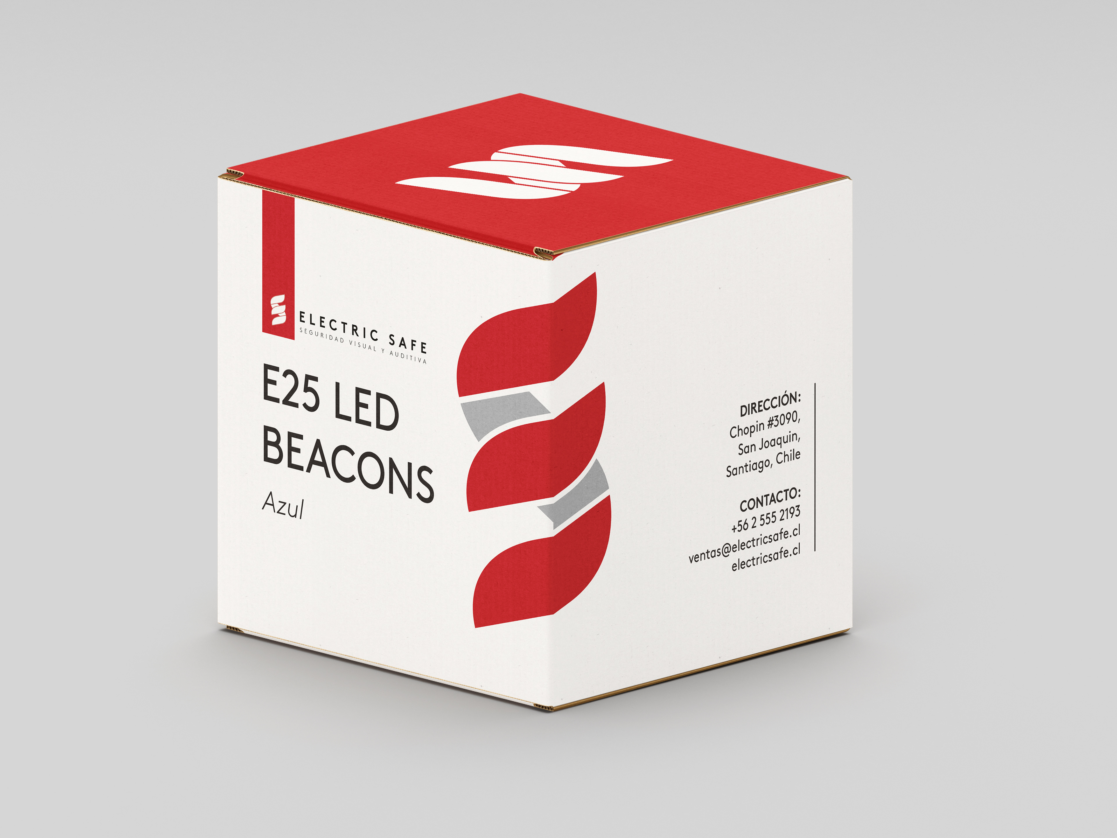
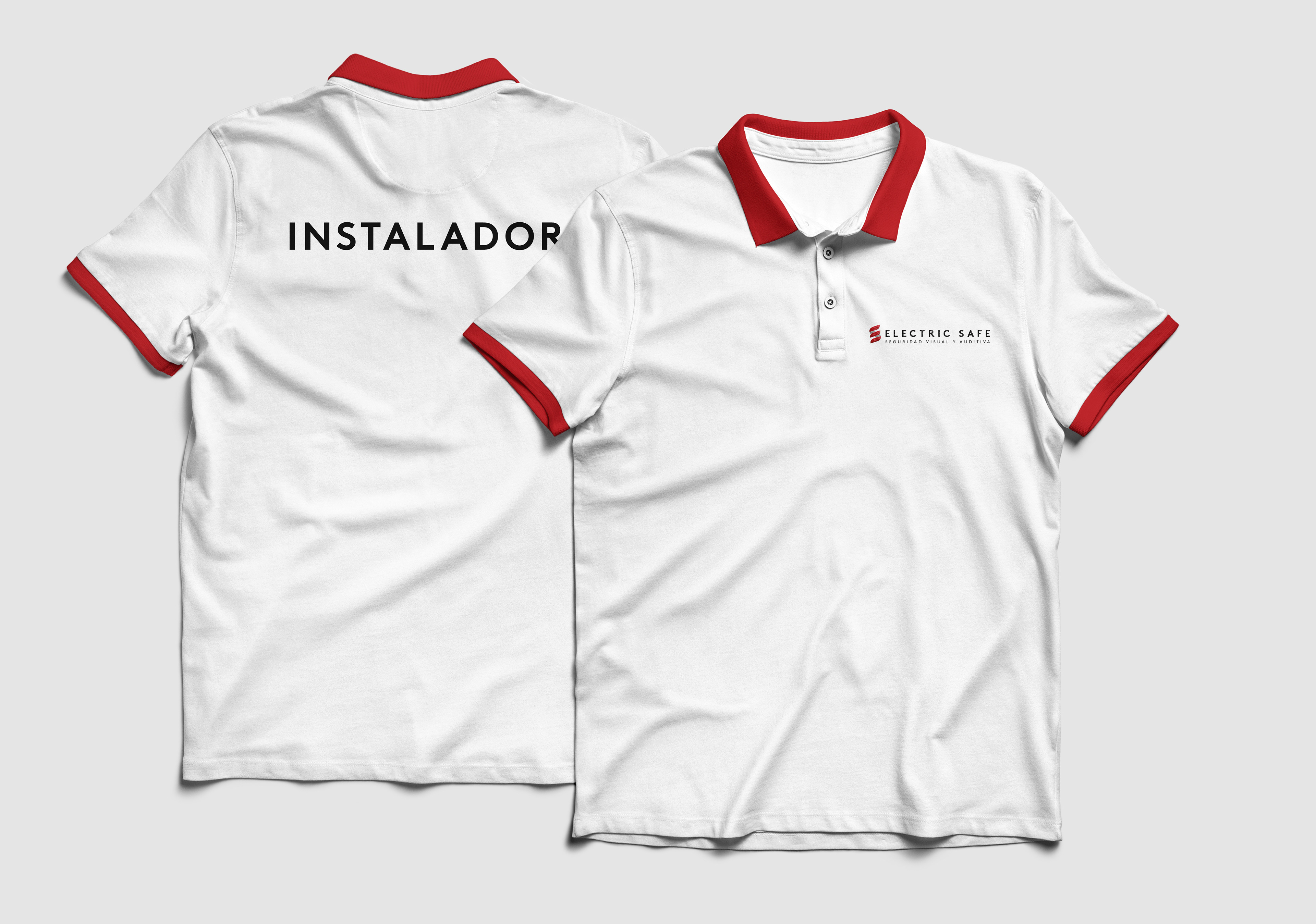
The brand was made with new typography, with the initials "E" and "S" for the symbol as previously, new colors, and a new tagline. This has created a unique logo that makes the mark visually recognizable and also a much more complete visual system to reflect all these desired aspects.
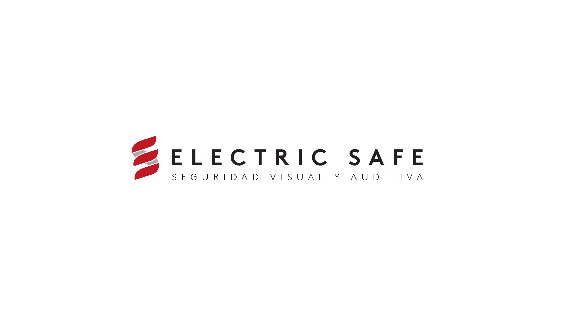
Logo
Logo Animado | Animated Logo
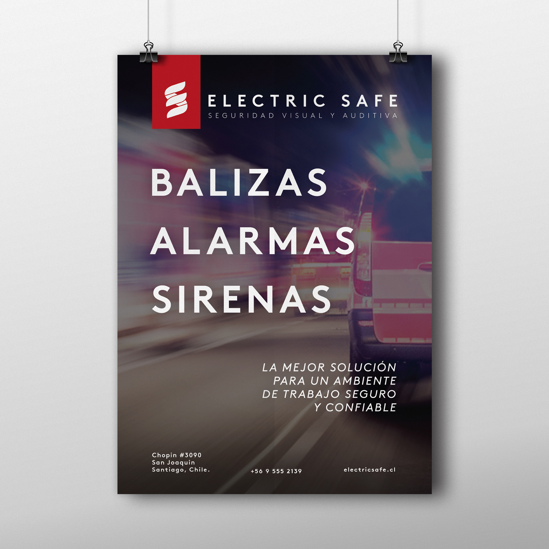
Cartaz Publicitário | Ad Flyer